Retail Musings
"How can money be the root of all evil, when shopping is the cure for all sadness..." Elizabeth Taylor
Blog posts tagged in Shop image

I’ve been out and around prowling through shops, doing some homework about what’s going on in the retail landscape.
Here’s some of what I found:
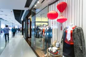
- Image is all about perception. How is your shop perceived by the shopping public? That perception is shaped by your advertising (including social media), the external appearance of your shop, the internal factors such as layout, colour schemes, fixturing, floor coverings, sounds (including music), merchandise ranges, lighting, attitude of the staff, ticketing and other promotional activity – to name just a few.
- The main problems I see in this regard are invariably conflicts of image from the outside to the inside and/or conflicts with the standard range and promotional merchandise, and in many instances, this comes about because the retailer has given little (if any) thought to the image they wish to project.
- If they are totally clear in their mind as to the image they want to portray – how they want to be perceived – then conflicts of image are unlikely to occur. Let me illustrate what I’m on about:
- One small apparel shop had me totally confused when on the outside I was seeing downmarket colour schemes and signing, but when I entered I was taken upmarket with tasteful quality fixturing. The floor was polished boards more suitable to a young market and yet the merchandise was only middle income aimed at ‘mature’ women.
- Another women’s fashion boutique – aimed very much upmarket, certainly looked it from the outside with colours and signing and the window display, but then I got a let-down inside with the wrong colour carpet, walls and ceiling, cheap fixturing and feature tickets stating price points at the bottom of the market, poorly hand written, coloured red on white (down marketing to me) and stuck to the racks with stickytape! I suppose I should have been relieved they didn’t use blutak…
- Another larger retailer I looked at was tastefully signed with a marble front but the moment you got inside you were taken downmarket at 100km per hour with rows and rows of side hung apparel on the walls in unbroken lines without any display points in evidence and masses of round floor racks. Reeked of cheap!
- Another retailer made the fatal mistake of projecting an upmarket image throughout, that frightened off their typical customer (and their established base) as well as the customer who was attracted to the shop because in that instance the range was pitched below their lifestyle and taste levels.
- A furniture retailer whose strongest price point in lounge suites was around the $1000 mark, ie their typical customers spend between $600 and $1300, was losing their business because they were allowing their store managers to buy to their taste level which was NOT compatible with their typical customer. As a result 80% of stock on the floor was priced over $1300 when in fact it really should have been the reverse – 80% below $1300 was perhaps closer to being right!
- Some buying/promotional groups have been guilty (and a few still are) of including too many lines of a “one-up” nature in catalogues that likewise bear little relationship to what their credibility is based on. One might well ask the question whether these groups have really done any range planning in terms of basic standard ranges that will be in all stores (with expansion of that range for the larger ones) – where it is possible to do this.
- A discounter that laid claim to being such, presented his store in a very low key “soft sell” manner when he was operating at the lower end of the market. He didn’t present the image of a real discounter. Instead, he should have been hitting it hard with strong, aggressive ticketing, massive displays etc. A conventional retailer nearby was merchandising stronger than he was and taken the business off him, in some instances at higher prices!
- A shop operating about the middle of the market was having a “stock take sell out” sale and stuck with their standard layout and display methods – they simply signed the windows and increased the number of tickets.
Retailers should never be afraid to “rough their store up” in a genuine sale – whilst its on. This creates a “bargain” environment and adds to the excitement and atmosphere and shouldn’t cause any permanent damage to their image.
Hopefully your image is making sense to your customers. If not, you might want to revisit and fix things!