Retail Musings
"How can money be the root of all evil, when shopping is the cure for all sadness..." Elizabeth Taylor

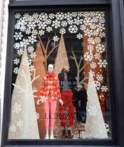
In previous blog posts I talked about the importance of stamping your mark on Christmas and your window backgrounds. Let's now complete your display by looking at your Mid and Fore Grounds.
Mid Ground
This is the main body of the window display and generally provides the main opportunity to promote your products/message.
The mid ground consists of your window kit (basis to build your displays on) and the products you want to dress/promote.
A key component in the mid ground is to ensure you group the basic kit correctly first. It is vital that the whole window has a theme so that the display has maximum impact. This theme could be colour, lifestyle, brand, material/pattern, story.

Lets talk Backgrounds on your Christmas window displays. This could be the back wall of your window or a back drop that you install.
The purpose of the background is to focus your eye on the display rather than the busy environment of the shop behind.
If you have a back wall this can be painted into seasonal colour to provide interest or you can attach graphics|decals to create the right mood.
Alternatively you can create an effective background to your display by hanging a decorative garland or suspending decorative items from the ceiling.
...
Festive Cheer
If you can’t get a little creative at Christmas, when can you? While your store window displays shouldn’t all be about Christmas trees and faux snow (so unrealistic here in Oz), you shouldn’t forego the festive cheer.
Customers will expect – and love – to see your take on Christmas window dressing, so you shouldn’t be afraid to think outside the box.For retailers across all sectors, there are a lot of ways you can spread a little Christmas cheer with your windows.
...
I’ve been out and around prowling through shops, doing some homework about what’s going on in the retail landscape.
Here’s some of what I found:
- Image is all about perception. How is your shop perceived by the shopping public? That perception is shaped by your advertising (including social media), the external appearance of your shop, the internal factors such as layout, colour schemes, fixturing, floor coverings, sounds (including music), merchandise ranges, lighting, attitude of the staff, ticketing and other promotional activity – to name just a few.
- The main problems I see in this regard are invariably conflicts of image from the outside to the inside and/or conflicts with the standard range and promotional merchandise, and in many instances, this comes about because the retailer has given little (if any) thought to the image they wish to project.
- If they are totally clear in their mind as to the image they want to portray – how they want to be perceived – then conflicts of image are unlikely to occur. Let me illustrate what I’m on about:
- One small apparel shop had me totally confused when on the outside I was seeing downmarket colour schemes and signing, but when I entered I was taken upmarket with tasteful quality fixturing. The floor was polished boards more suitable to a young market and yet the merchandise was only middle income aimed at ‘mature’ women.
- Another women’s fashion boutique – aimed very much upmarket, certainly looked it from the outside with colours and signing and the window display, but then I got a let-down inside with the wrong colour carpet, walls and ceiling, cheap fixturing and feature tickets stating price points at the bottom of the market, poorly hand written, coloured red on white (down marketing to me) and stuck to the racks with stickytape! I suppose I should have been relieved they didn’t use blutak…
- Another larger retailer I looked at was tastefully signed with a marble front but the moment you got inside you were taken downmarket at 100km per hour with rows and rows of side hung apparel on the walls in unbroken lines without any display points in evidence and masses of round floor racks. Reeked of cheap!
- Another retailer made the fatal mistake of projecting an upmarket image throughout, that frightened off their typical customer (and their established base) as well as the customer who was attracted to the shop because in that instance the range was pitched below their lifestyle and taste levels.
- A furniture retailer whose strongest price point in lounge suites was around the $1000 mark, ie their typical customers spend between $600 and $1300, was losing their business because they were allowing their store managers to buy to their taste level which was NOT compatible with their typical customer. As a result 80% of stock on the floor was priced over $1300 when in fact it really should have been the reverse – 80% below $1300 was perhaps closer to being right!
- Some buying/promotional groups have been guilty (and a few still are) of including too many lines of a “one-up” nature in catalogues that likewise bear little relationship to what their credibility is based on. One might well ask the question whether these groups have really done any range planning in terms of basic standard ranges that will be in all stores (with expansion of that range for the larger ones) – where it is possible to do this.
- A discounter that laid claim to being such, presented his store in a very low key “soft sell” manner when he was operating at the lower end of the market. He didn’t present the image of a real discounter. Instead, he should have been hitting it hard with strong, aggressive ticketing, massive displays etc. A conventional retailer nearby was merchandising stronger than he was and taken the business off him, in some instances at higher prices!
- A shop operating about the middle of the market was having a “stock take sell out” sale and stuck with their standard layout and display methods – they simply signed the windows and increased the number of tickets.
Retailers should never be afraid to “rough their store up” in a genuine sale – whilst its on. This creates a “bargain” environment and adds to the excitement and atmosphere and shouldn’t cause any permanent damage to their image.
Hopefully your image is making sense to your customers. If not, you might want to revisit and fix things!

It isn’t the big things that ruin us. That is definitely true of image. It is all the little things we fail to give attention to that rob us of success. Bobbie Gee
Five Golden Rules of Display
• Know your customer - set your displays to capture YOUR customers' attention.
• Don’t damage the merchandise - never pop damaged merchandise out on the salesfloor unless its in a dump bin.
• Realise your time limitations - when doing displays know it will take you four times longer than you were planning.
• Be willing to learn - gather inspiration from pinterest!
• Change your display often - weekly if possible. Just tweak it, change the focal points, colours...
Five Reasons for Displays
• Attract attention - get customers into your shop and focussed on your products.
• Arouse interest - hmmm, what's that? Can I use it?
• Create desire - I MUST have it. It will be perfect for ...
• Win confidence - Shop looks great, staff are knowledgeable and friendly.
• Motivate the purchase NOW - Right. I'm having it!

Consider the following factors when planning your Christmas Visual Merchandising strategy:
Product: Your product needs to be your shop's greatest hero. To create a significant point of difference, plan your product range carefully to ensure you have considered high volume merchandise and the products creating stories. Plan the placement of these product ranges so there is a balance of volume and value as well as eye-catching highlight displays as your hero.
Creative planning and capitalising on the prime season: The festive trading period can constitute up to 40% of a retailer's annual trade. It is not only important from a financial perspective but it is also the most crucial time to cement new relationships with customers. To maximise this opportunity retailers need to use creativity to their strategy to build a point of difference to competitors.

Visual impact is a huge component of retail merchandising. Customers enteringmannequins a shop are greatly influenced by the visual information they gather in that first split second. One simple visual element, such as colour, can catch a shopper's attention and greatly affect their mood.
In today's ultra competitive marketplace it is of paramount importance that retailers understand the basics of visual merchandising.
Here are 10 visual merchandising tips to help you maximize your efforts:

Unlike the familiar saying, “Don’t judge a book by its cover” people do judge a shop by its “cover”.
The first impression a person is going to get of your shop is from its windows, the front door and the outdoor signage. Many a decision on whether or not to enter is going to be based on this first impression. Furthermore, if the potential customer does get by the cover and enters the shop, they must feel comfortable inside, or chances are they will walk right out.
So it is important that both the inside and outside of your shop are kept as attractive as possible. Both should reflect a personality and image that appeals to your target audience.
Think of your shop as you would of an impulse item.
You want the passerby to be stopped in his or her tracks by your windows and signage, and drawn right through the front door. Then, once the customer opens the door, you want them to be further drawn to your merchandise.
Start with your footpath or car park. You want it to be head and shoulders above all the other footpaths on the same street. If someone surveys the entire block from across the street, you want your entire package – footpath or carpark, shop and signage – to stand out from all the others. And don't forget to sweep!

Visual merchandising used to be about “making pretty”. Today it is challenged with making sales. It’s current status today is as a sales-supportive entity, which impactsLafayette Maison Paris store design, store signing, departmental merchandise placements + display, store atmospherics and store image.
Visual merchandising can transform a shopper into a buyer. It can increase the average dollar amount per sale. Effective displays teach shoppers about using multiple basic and accessory items to enhance and extend the use of their purchases. It’s not uncommon to hear a shopper say, “I’d like to purchase the entire display”. That’s silent selling at its best.
In-store displays should do the following:
communicate the latest trends and colours;
assist the customer in making a buying decision; and
create an exciting environment in the store

Have you ever gone into a shop to buy a single item and let with a cartload of things you hadn't intended to buy? Congratulations! You have fallen victim to some other retailers' merchandising strategy. shopping trolleyWhen a shop is merchandised well this becomes a common occurrence.
Visual merchandise is projected on entry to the shop and you need to direct the prospective customer's eyes and feet to a successful sale.
So let's look at some of the things you can do:
THE LINK
A customer has seen your special promotion in the window, enters your shop and turns which way? You need to monitor your customer flow: Do they generally turn right, left or stop and look puzzled? Watch the customer flow and gauge reactions to your layout.
You should strategically display the merchandise that you are selling and make sure the new range of merchandise is easily spotted. Let's start to organise your interior.

Effective merchandising demands the most effective use of available retail space, ultimately seeking to capture the impulse of the customer to buy more and to buy better. An understanding of customer behaviour in the shop, often learned through trial + error and observation can be used as a positive sales tool.
It is telling that large retailers employ policies of shop layout, based upon research and understanding of consumers' purchasing patterns.
An initial consideration is a basic building floor plan, and every shop through it's physical layout will have areas which draw higher traffic, as well as areas of the shop which may not be explored so much for reasons such as congestion (perceived or real) or simply being at a distance from the point of entry.

See the quality and utility
See the price
Self-select
The customer must be able to do all of the above in the shortest possible time
In the light of the broad layout principles discussed above, it is now possible to focus on where best to place the merchandise and how best to display it. The following notes provide a summary of the principles and key issues that need to be considered.