ShopTorque
Thoughts, ideas, tips and musings as I work alongside small business owners helping them love their businesses back to life!
Stop Them In Their Tracks
- Font size: Larger Smaller
- Hits: 4743
- Subscribe to this entry
- Bookmark
Unlike the familiar saying, “Don’t judge a book by its cover” people do judge a shop by its “cover”.
The first impression a person is going to get of your shop is from its windows, the front door and the outdoor signage. Many a decision on whether or not to enter is going to be based on this first impression. Furthermore, if the potential customer does get by the cover and enters the shop, they must feel comfortable inside, or chances are they will walk right out.
So it is important that both the inside and outside of your shop are kept as attractive as possible. Both should reflect a personality and image that appeals to your target audience.
Think of your shop as you would of an impulse item.
You want the passerby to be stopped in his or her tracks by your windows and signage, and drawn right through the front door. Then, once the customer opens the door, you want them to be further drawn to your merchandise.
Start with your footpath or car park. You want it to be head and shoulders above all the other footpaths on the same street. If someone surveys the entire block from across the street, you want your entire package – footpath or carpark, shop and signage – to stand out from all the others. And don't forget to sweep!
If you have trees in front of your shop, plant flowers in the tree bases. Consider installing decorative lights on the trees, turned on at sunset. Originally used around the Christmas holidays, lighted trees are becoming popular year-round in many business districts. They’ll focus attention to your store front, especially if you have evening hours.
…. Then the signs, awning and canopy
A great deal of thought should go into your decision on how to display the store’s name as well as whether or note you will have a canopy or awning over your windows and/or doors.
…. Look at the windows
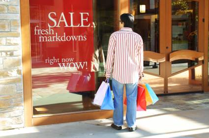
The one place where you should not cut any corners is with your windows. They might be the most important part of the store because they set the scene for what the customer will find inside. When properly used, your windows are your least expensive and most effective form of advertising. They bring customers into the store!
Your first step should be to decide on an overall philosophy of how you will use your windows, what you want them to say, and how you want them to deliver your message. There are many options available, and what you do and how you do it will largely depend upon your marketing strategy.
Here are some things to consider for your windows:
A minimum of product versus a packed window?
Yes or no on price tags?
Movement in the window?
Finding a window decorator or doing it yourself?
AND NOW WE ENTER THE FRONT DOOR
The first impression campaign should continue with your front door. It is only a small piece of the picture but an important one, which is all too often ignored.
How many shops have a sign on the door that says, Welcome, Please Come In and Browse, Welcome To Our place? Probably very few, yet such signs are inexpensive to have made and make a ‘friendly’ first impression.
Use the front door as a continuation of your window. If the windows are promoting a sale or special event, have a sign on, or over, the door relating to the event: Welcome to our spring clearance sale, or meet Tony the Jeans expert, etc. Sometimes a sign isn’t necessary to serve as a bridge. For example, you are promoting St Patrick’s Day in the window, all you would need on the door are shamrocks.
Not only should you have a welcome sign of some type on the outside of the door but you should also have a thank you sign on the inside that the customer sees on the way out. It might read, thank you for shopping with us, thanks for your support, have a safe trip home or we appreciate the time you spend with us.
Other than the single sign, your front door should be clean and provide a clear view into your shop. You want the passerby who is turned on by the window to have a good view of the interior when they approach the door.
Inside … a customer friendly store
There are many steps you can take to make shopping an easier and happier experience for your customers:
Your merchandise should be organised in such a way that customers will easily find what they want. The larger your shop the more directional signage you will need.
It is important that your products be displayed so that you can maximise their appeal within the store. Identify those with very strong eye appeal and use them as a major focal point. Always have an interesting product or display featured up front and visible from the outside of the shop. It should be aimed at attracting the attention of passersby, and at grabbing the interest of customers walking through the front door. Try colour co-ordinating displays and merchandise.
Whenever you have a limited sale, or if you have regular sale table, it should always be in the rear of the store so that customers will have to pass all of your other product displays to get to the bargains. You’ll never know how much additional business you will pick up this way.
The aisles should be wide enough for customers to walk through without bumping into displays and counters.
Remember, the easier you make it for customers to shop with you, the more they will spend with you. Rocket science really...
